Data Visualization Day 2021
On Friday, April 30, Hewlett Packard Enterprise Data Science Institute (HPE Data Science Institute) and UH Libraries virtually hosted Annual Data Visualization Day 2021. It was a day of exciting discussions involving all things data visualization.
Data visualization is the representation or illustration of data through graphics such as charts, plots, animations and infographics. These tables, charts and graphs illustrate powerful representations of various data points so that trends can easily be seen by the human brain.
Visualization displays information to reveal patterns and communicate complex relationships between different data, making the it easier to understand. Important insights are hidden within large amounts of data, and when you can look at data presented in a visual way, patterns and insights can emerge that may otherwise be lost.
Soumyendu Sarkar, distinguished Technologist & Director of Artificial Intelligence for HP Labs at Hewlett Packard Enterprise, gave a presentation on visualization in the world of Big Data, and how visualization is essential to analyzing large amounts of information in order to make accurate, data-driven choices. At HPE, Sarkar specializes in driving corporate AI strategy as well as Deep Learning solutions with software engineering, research and innovation, hardware optimizations and data pipelining. In his presentation, he used his knowledge and background in data visualization to explain how visualizing data could simplify patterns for fields of service including video production, airport video analytics and predictive maintenance.
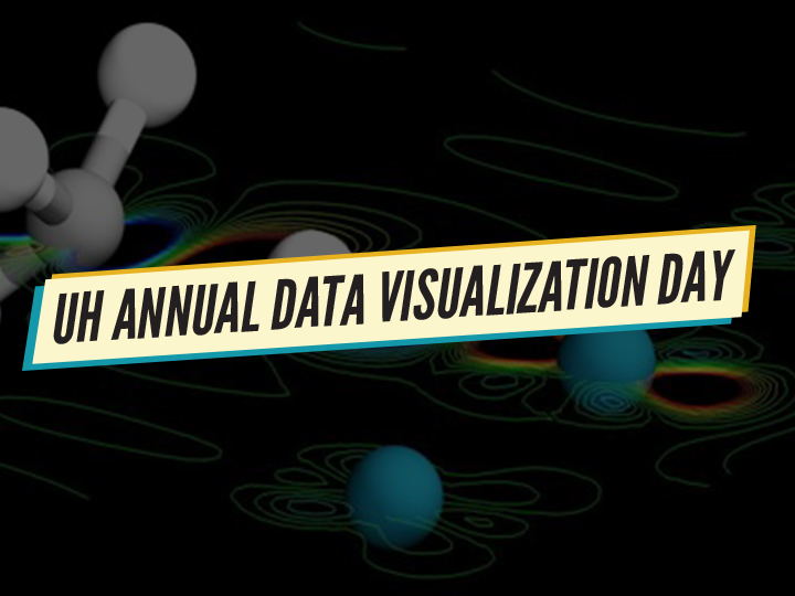
After Sarkar’s compelling presentation on data visualization, students from all majors and graduate levels presented their data models in the data visualization contest. This was an opportunity for students from different departments, who are working on a variety of different research projects, to present a visualization of their work. Presentations were diverse, ranging from graphs illustrating data regarding neighborhoods in Seattle and their average cost of living to charts highlighting brain activity in twins. The first-place winner of the contest was Griffin Litwin and his use of data visualization illustrated the similarity between siblings in reading ability. The second-place winner was Surya Pratap Solanki, who visualized the dynamic evolution of active sites in Pd/CHA during passive Nitrogen Oxide adsorption.
“Data visualization is more than an endpoint or presentation of a project,” said Litwin. “Data visualization is at a crossroads of art, communication and science. It allows us to connect with and understand structure or phenomenon in a way that is not fully possible otherwise. I want my work to be true to that potential, and am grateful to HPE Data Science Institute for the opportunity and recognition.”
“It was a wonderful experience to participate in the Institute’s Data Visualization Day and to learn more about the techniques being used for data visualization in various fields,” said Solanki. “The effective visualization of data is increasingly important to communicate results and to connect with audiences from a different background. I am grateful to the HPE Data Science Institute for providing the opportunity to share my visualization piece with other students and faculty, and for providing the necessary resources to perform the quantum chemistry simulations for my project.”
Congratulations to both Litwin and Solanki, and thank you to all who participated in the contest.